
The new world order is rearranging itself on the planet and settling in
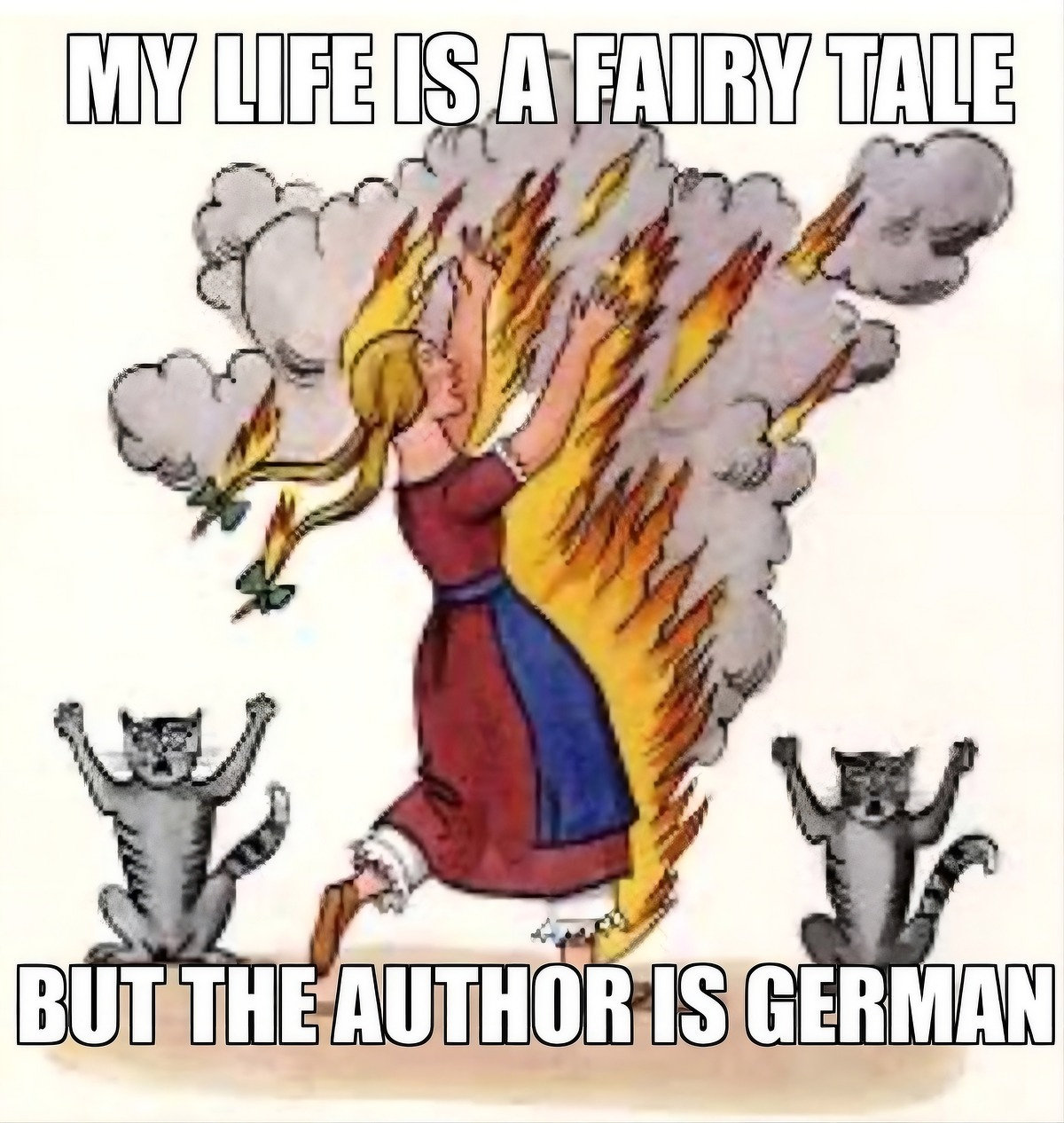
I was sure I’d written about this article from 2020 with the evocative title “Fuck the Bread. The Bread Is Over”. Written during the early days of the pandemic, Sabrina Orah Mark weaves motherhood, professional identity, and fairy tales for a column entitled Happily (which ran until March 2021).
The parts I’ve excerpted contain a lot of questions about a world that has changed, and is, changing rapidly. Mark contrasts the world of fairy tales, where each character is made entirely of their role, like a stick of Blackpool rock, with the lives knowledge workers now live, dragged slowly into the Precariat.
What does it mean to be worth something? Or worth enough? Or worthless? What does it mean to earn a living? What does it mean to be hired? What does it mean to be let go?
In fairy tales, form is your function and function is your form. If you don’t spin the straw into gold or inherit the kingdom or devour all the oxen or find the flour or get the professorship, you drop out of the fairy tale, and fall over its edge into an endless, blank forest where there is no other function for you, no alternative career. The future for the sons who don’t inherit the kingdom is vanishment. What happens when your skills are no longer needed for the sake of the fairy tale? A great gust comes and carries you away.
In fairy tales, the king is the king. If he dethrones, his bones clatter into a heap and vanish. Loosen the seams of the stepmother, and reach in. Nothing but stepmother inside. Even when the princess is cinders and ash, she is still entirely princess.
[…]
The new world order is rearranging itself on the planet and settling in. Our touchstone is changing color. Our criteria for earning a life, a living, are mutating like a virus that wants badly to stay alive.
[…]
I feel like I’m in Gertrude Stein territory, where the buttons are so tender they’ve come undone. The whole kingdom is spilling out of itself. There are holes everywhere.
Source: The Paris Review
Image: Are.na

We live in an economy that has systematically destroyed the conditions for trust, and then charges us for the workarounds

This is from an economics blog, so focuses on money, but I think it’s equally true of the kind of politics we’ve got at the moment. When people don’t trust each other, then they look to so-called “strong men” to save them from a non-existent, manufactured threat.
Think about what a low-trust economy actually looks like in practice. Everything gets expensive. Contracts get thicker. Lawyers get richer. Every transaction requires documentation, verification, third-party guarantees.
The friction is very much structural. It’s a tax on everything, paid in time, money, and cognitive bandwidth.
Last week, I wrote about 2025 as the year the grift economy went mainstream — surveillance pricing, prediction markets, AI slop, fraud at industrial scale. All of that is real. But it’s downstream of something deeper: we live in an economy that has systematically destroyed the conditions for trust, and then charges us for the workarounds.
[…]
[C]onsider the job market. Fake job listings — “ghost jobs“ that companies post with no intention of filling — have become so pervasive that they distort labor market data and waste millions of hours of applicant time.
Why do they exist? Because companies discovered that the appearance of hiring is useful for investor relations, for internal politics, for building a candidate pipeline. The cost is externalized onto the people who spend hours tailoring resumes and sitting through interviews for positions that were never real.
When the system rewards dishonesty, dishonesty is what you get.
[…]
When institutions and corporations behave in predatory ways, individuals start to adopt the same logic. If the system is a grift, then grifting becomes rational. If everyone is trying to extract value from you, why wouldn’t you try to extract value from them?
The explosion of scams, side-hustle culture repackaged as “courses” that teach you to scam others, dropshipping empires built on misleading ads, influencer marketing that can’t be distinguished from real advice.
[…]
The scam economy is what a low-trust system produces. When people lose faith that playing by the rules leads to fair outcomes, the rules start to feel optional. And once that happens, trust erodes further, which makes the rules feel even more optional, which erodes trust further still. It’s a death spiral.
Source: Your Brain on Money
Image: Bernard Hermant
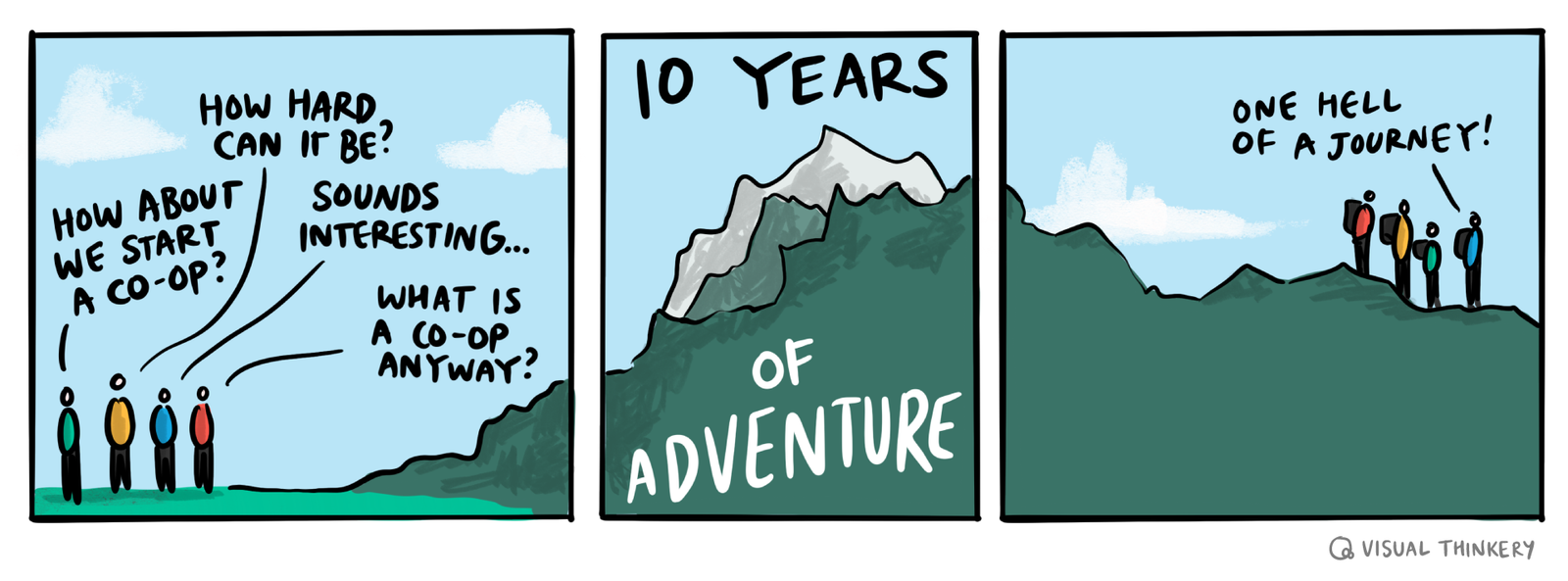
My goal is to encourage people to take action and look at the alternatives that are on the table
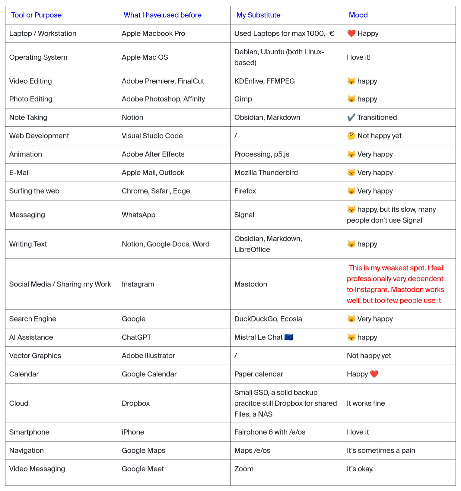
An important part of TechFreedom is not just talking about reducing dependency on Big Tech, but getting on and doing it. Tom posted his ‘stack’ this week, which was an update to his post last year. It shows that, like me he’s moving towards more and more Open Source-based workflows.
The table above and quotation below comes from a post by Tim Rodenbröker, a designer, hacker and content creator, who in December 2025 outlined his switch from Apple and Adobe to Open Source.
Switching all of my workflows to Open Source is an long-term, ongoing project. It all started with a broken laptop in 2019 which I have repaired by installing a Linux Operating System called Ubuntu. Since then, I slowly removed the software and hardware of companies I do not trust. And I have learned that there are incredible open source alternatives.
I think that many people sabotage their own opportunities to enter this space by adopting a purist mindset, an all-or-nothing mentality. This frustrated me quite some time myself, but I have learned to approach this project iteratively and remain aware that there is no definitive end to this journey.
My goal is not to show people how to become hermits; I will never move into the forest and live on grapes and mushrooms (I promise). My goal is to encourage people to take action and look at the alternatives that are on the table.
Source: trcc
The patient as transcription layer

I had a similar experience last year attempting to get a diagnosis for a different cluster of symptons. While I totally get the ethical issues and potential problems with using AI in medicine, the waste (and patient frustration) is incredible.
Everyone worries about AI replacing doctors. After 24 hours in the hands of the NHS, I think they’re looking in the wrong direction.
GP, A&E, then other parts of the hospital. Every shift, a new doctor. Every new doctor, the same questions. The same story, retold from the top. Every single one of them then took a picture of my rash with their phone.
The first GP I saw actually had an AI assistant. It recorded our conversation and drafted a letter, which he printed on that grey recyclable paper the NHS uses for everything and which absolutely no one in the chain that followed ever read.
Meanwhile, I had Claude in my pocket. It knew my whole story from the first symptom. It could interpret the blood results before the doctor did, and flag a couple of things worth asking about. By the third doctor, I was essentially a transcription layer between Claude and the NHS.
Source: Paolo’s Weblog
Image: Immo Wegmann
On the gendered nature of (types of) hobbies
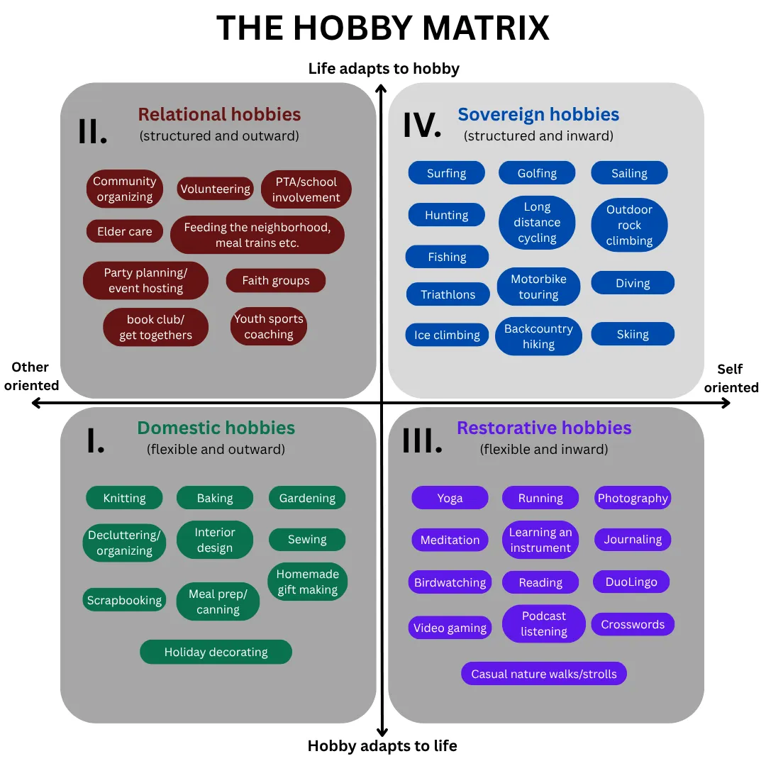
This is an interesting look at the gendered nature of hobbies, how they’re coded, and how people treat them as provisional or non-negotiable. I’ve never been a woman, and never been in a long-term relationship with anyone other than my wife, so I don’t know how this works for other people.
What I do know is that there’s at least three forces at play here: gender norms and differences, peer pressure (real/imaginary) and expectations of self. The important thing is to talk about them, and I appreciate this post as opening up space to do that.
On one axis is a simple question: who does the hobby primarily serve? Some hobbies benefit others or the household — they produce something useful or supportive, something that flows outward. Others revolve around relationships and social connection. And some hobbies exist purely for the person doing them, serving no one but herself.
On the other axis is a less obvious question: who adapts to whom? Does the hobby fit itself around life, squeezing into whatever time is available? Or does life rearrange itself around the hobby, moving other things aside to make room?
[…]
What’s happening is not simply that men choose different hobbies. It is that men treat their hobbies — whatever they are — as non-negotiables, while women treat theirs as provisional. Men bring an entitlement to leisure that operates almost independently of what the activity is. Women bring a posture of permission-seeking and when they push back, as I did, they are made to feel they are asking for something extraordinary rather than basic consideration. The result over time is a gravitational pull: men drift upward toward the fourth sovereign quadrant regardless of what their hobby is. Women’s participation in sovereign hobbies get pull downward towards the elective.
Source: Astrid
Digital literacies involve layers of abstraction

On the one hand, yes I feel this. On the other hand, things change! There are layers of abstraction, especially with computing.
I was having a conversation with someone recently who’s senior in an educational computing organisation. We both agreed that the equivalent of Mozilla Webmaker these days wouldn’t be teaching kids HTML, CSS, and JavaScript; we’d be teaching them how to understand and use AI tools to achieve their ends. This is still making.
There’s a certain kind of person who’s becoming extinct. You’ve probably met one. Maybe you are one. Someone who actually understood the tools they used. Someone who could sit down at an unfamiliar system, poke at it for twenty minutes, and have a working mental model of what it was doing and why. Someone who read error messages instead of dismissing them. Someone who, when something broke, treated it as a puzzle rather than a betrayal.
That person is dying off. And nobody in the industry seems to care. In fact, most of them are actively celebrating the funeral while billing it as progress.
This isn’t an accident. This is the result of two decades of deliberate, calculated effort by the largest technology companies on earth to turn users into consumers, instruments into appliances, and technical literacy into a niche hobby for weirdos. They succeeded beyond their wildest expectations. Congratulations to everyone involved. You’ve built a generation that can’t extract a zip file without a dedicated app and calls it innovation.
[…]
The concept of a filesystem — of hierarchical storage that you own, that lives on hardware you control, that persists independently of any company’s servers — is genuinely alien to them. Not because it’s complicated. A child can understand that files live in folders. But they’ve never had to understand it because the platforms they grew up on hid it from them. iOS shipped without a user-accessible filesystem for over a decade. Google Drive abstracts away the folder metaphor entirely if you let it. iCloud will “optimize” your local storage, which is a polite way of saying it will silently move your files to Apple’s servers and give you a ghost of them on your own machine, and most users have no idea this is happening or what it means.
[…]
The users who grew up on these platforms don’t know what they’re missing. They’ve never used a system where they were genuinely in control. The idea that you should be able to run arbitrary code on hardware you paid for is foreign to them — not rejected, but simply absent as a concept. They’ll defend the restrictions without prompting because they’ve internalized the vendor’s framing so thoroughly that they experience the cage as comfortable. “I don’t want to root my phone, that sounds scary.” Cool. You’ve successfully trained yourself to be afraid of ownership. The platform vendors are proud of you.
[…]
The obituary for the power user is being written right now. The people writing it are the same ones who sold you the phone, designed the app store, wrote the terms of service you didn’t read, and built the algorithm that decided you didn’t need to see this.
Source: fireborn
Image: Creative Minds Factory
How power structures and relationships really work
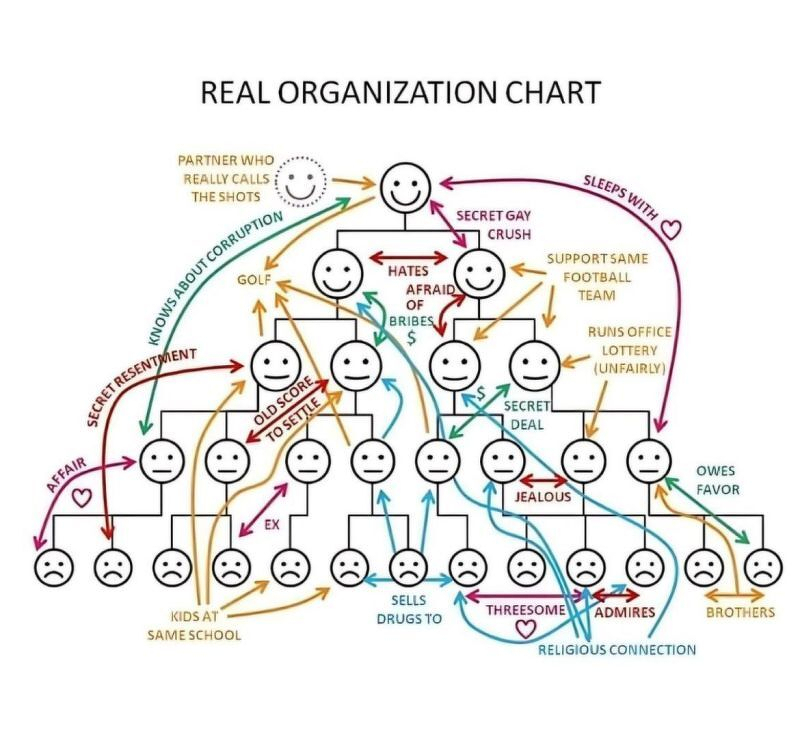
I’m not sure what I enjoyed more, the org chart showing how power structures and relationships really work, or the LinkedIn comment that said:
Very interesting how the dealer sells to his coworkers, and yet they’re still sad.A lack of clearly defined KPIs and regular milestone celebrations can make it difficult to maintain alignment and momentum with stakeholders. Would be insightful to create a internal customer feedback loop here.
Source: LinkedIn
Time as an instrument?

I’m fascinated by this. Not fascinated enough to pay $21.99 to use it on just one of my devices, but I just think it’s a really interesting example of reducing functionality, working hard on the aesthetic, and making something simple to use.
I can, and do, use Toggl which is much more fully-featured, but there’s something to be said for things being nice to use. Perhaps I need to create my own cross-platform version, rather than an Apple-only one, as I did with Stream…
Source: interval for macOS
The concentration of power in AI labs is now one of the defining political questions of the decade

This is an excellent post which talks lucidly about what it means for power to be decentralised in the world of AI. The author, Alex Chalmers, argues that decentralisation is not automatically good; it only works when embedded in a framework that can coordinate local actors, define boundaries, and step in when things go wrong.
Chalmers draws on historical thinkers and different traditions, ultimately arguing that if we care about pluralism and autonomy, we should design bounded decentralisation with explicit constitutional guardrails. In other words, we shouldn’t just assume “more nodes” or “more voices” automatically means more freedom.
In today’s world, a handful of companies control the compute, data, and frontier models that are restructuring how billions of people interact with the world. Existing institutions are struggling to keep up. The concentration of power in AI labs is now one of the defining political questions of the decade.
Many are unhappy about this development, with groups like the AI Now Institute, the Distributed AI Research Institute (DAIR), and the Algorithmic Justice League arguing that AI development as currently constituted is irredeemably centralizing. They believe that we need to relocate authority away from corporations and regulators towards the communities most affected by these systems. When policymakers look for alternatives to the status quo of corporate self-governance and light-touch regulation, these groups are frequently in the room.
Ideas around participatory AI governance draw on a deep intellectual tradition that integrates technology and power, dating back to nineteenth century anarchism and running through twentieth century American social theory. While elements of the diagnosis have force, both the analysis and the prescriptions suffer from fatal flaws that become even more acute in the AI age.
[…]
If your starting premise is that human flourishing is what happens when the megamachine gets out of the way, you don’t need to weigh the goods it produces, because they aren’t really goods. You don’t need a theory of when expertise is legitimate, because expertise is a symptom of the problem. You don’t need mechanisms against capture, because capture is what happens under the current system and will dissolve along with it.
The intellectual apparatus is structured to avoid the questions that a functional governance regime has to answer. What looks like a program for radical democracy turns out to be a refusal of the conditions under which democratic decisions about complex systems can be made at all.
[…]
[G]overnance must go where the knowledge is. This could be professional bodies, academic institutions, or open-source communities. They would each govern usage within the domain where their members have the requisite competence and stakes. Fortunately, most of these institutions already exist. They do not need to be designed from first principles or assembled by the participation industry.
While the vast majority of governance questions are deployment problems where domain-specific institutions have the advantage, there are a handful of bigger challenges that sit above this. Problems like the security of frontier model weights or thresholds for certain dangerous capabilities sit at a higher layer that require a degree of either state or interstate coordination.
[…]
No quantity of nested enterprises can resolve the production-side concentration of frontier AI. A handful of labs control the most powerful models, and no amount of deployment-side checks and balances can change that.
But a thick ecosystem of intermediary institutions on the deployment side creates countervailing power. The labs must satisfy many masters rather than capturing one regulator, or, as the anarchist model would have it, being replaced by a constellation of community-run alternatives that will never match their capabilities.
[…]
Freedom has never depended on power being small. It has depended on power being answerable to more than one authority at a time, and on citizens belonging to institutions that can push back on their own terms. The task ahead of us is building that intermediary layer.
Source: Cosmos Institute
Image: Deborah Lupton
Grand ambitions vs reality
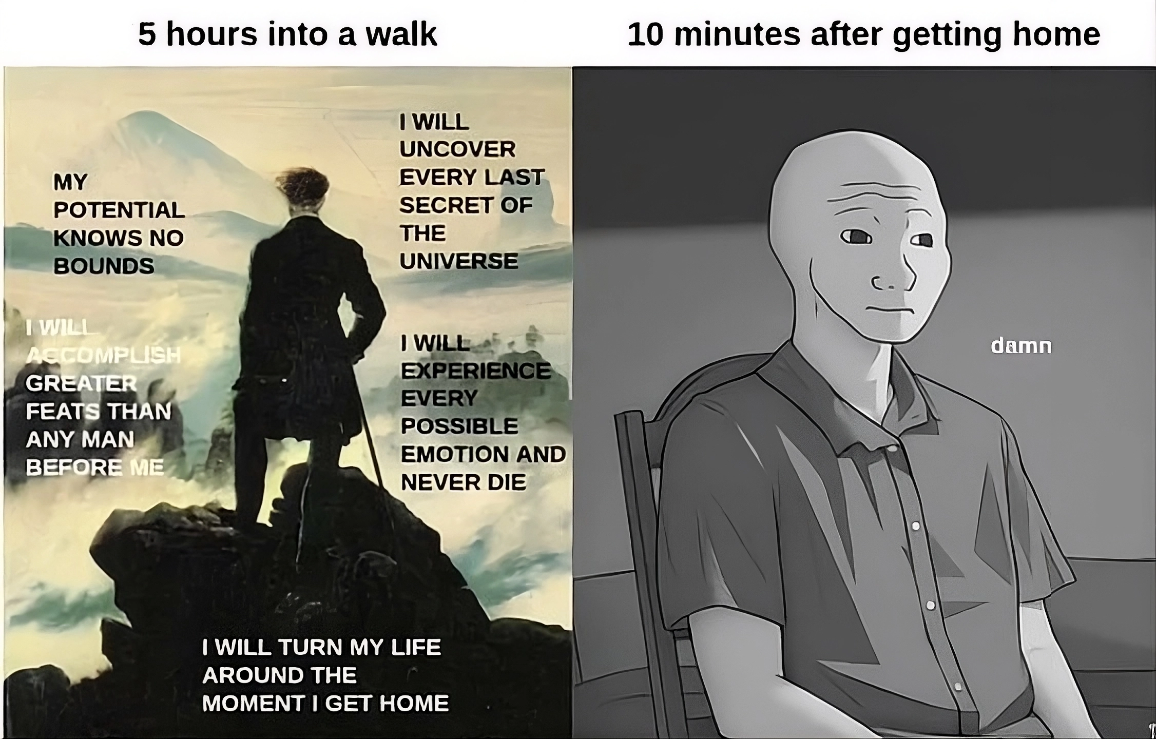
It’s not just walking, but solo travel of any sort that does this kind of thing to me. I’ve spent too long at home recently.
Source: Are.na
Renewable energy: 98% of days in Britain are either windy, sunny, or both
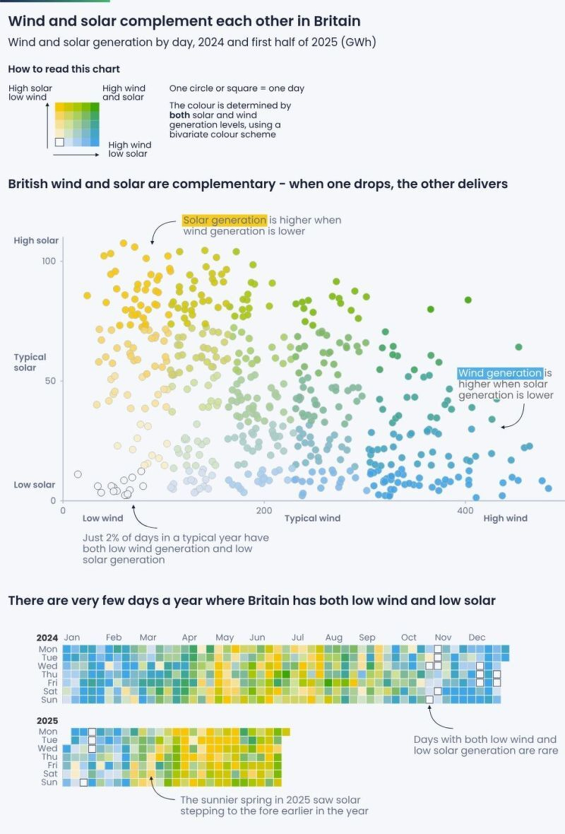
I discovered this particular one via LinkedIn, but the original creators of this infographic, Ember Energy, has loads of them on their website – mainly focused on the EU.
Source: LinkedIn
Having a system built on context puts the power in the people's hands
This post is by a journalist, talking about journalism. But it’s not a huge conceptual leap to think about this in terms of education.
The people who are stuck in the AI = chatbot are getting it all wrong. Interacting with an AI is an amazing way of connecting together things you care about in an order that suits you and the way you learn. It’s not just about sitting kids in front of a computer, but about finding ways of exploring human knowledge in ways that go beyond the limited experience of the people who happen to be available for guidance.
I was talking with Justin Spooner today about “multiplayer AI” which is really the problem that needs solving next. Learning isn’t a solo activity.
Even when the web granted us unlimited space, we stuck to [the] old formats. We gave everyone the same packaged product because that’s all we were able to do, and most of the primary material went nowhere.
Those constraints are gone now. Artificial intelligence and large language models mean we can make sense of all that source material that was previously left on the cutting room floor. That data is actually hugely valuable as unique, new information. And at the same time, the limits on how we create stories are gone. Generative AI can craft a story tailored to a single person and produce millions of those stories at once.
Given this change, making “content” the driving force and output for publishing systems no longer makes sense. What we need now is a new form of software for media companies to orient around: the Context Management System.
[…]
Having a system built on context puts the power in the people’s hands. The context becomes the raw material that AI can use to create a unique piece of media just for that person at that time. It can be text, audio or video based on what the user prefers, shaped by their preferences, location and time of day. The story can be customized based on where a person lives, their educational level, or what they know based on past consumption patterns.
Source: Hacks/Hackers
Image: BoliviaInteligente
Why I adore the night
I have noticed that when all the lights are on, people tend to talk about what they are doing – their outer lives. Sitting round in candlelight or firelight, people start to talk about how they are feeling – their inner lives. They speak subjectively, they argue less, there are longer pauses. To sit alone without any electric light is curiously creative. I have my best ideas at dawn or at nightfall, but not if I switch on the lights – then I start thinking about projects, deadlines, demands, and the shadows and shapes of the house become objects, not suggestions, things that need to done, not a background to thought.
– Why I adore the night, by Jeanette Winterson
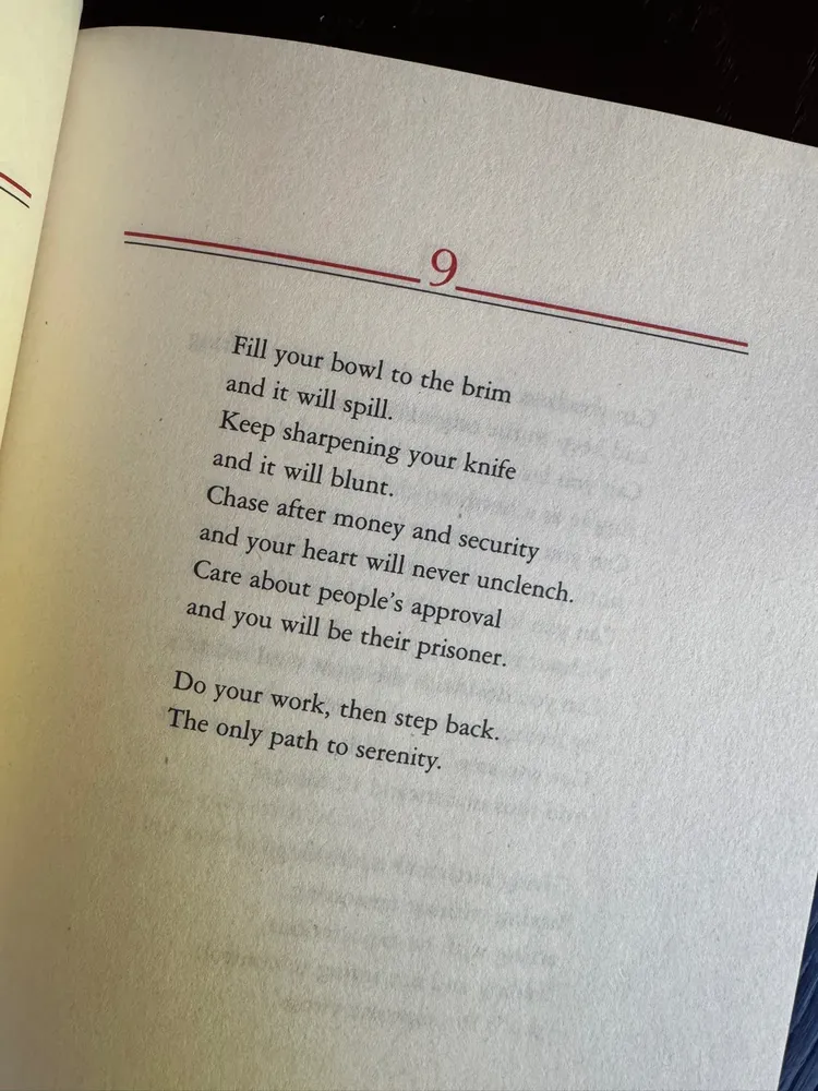
Life advice

Some people are fond of sharing the saccharine quote by Mary Oliver: “Tell me, what is it you plan to do with your one wild and precious life?” I, on the other hand, am more fond of much more down-to-earth reminders that we will soon be dust – or, as this piece of toast suggests compost.
Source: Are.na
The AI Adoption Spiral
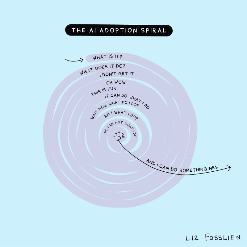
I love this from Liz Fosslien, as the outer part of it shows the journey that people go on with any new tool. The inner part, however, is more philosophical. And for some people it’s emancipatory and for others it gets really dark, quickly.
Source: Liz Fosslien