
Renewable energy: 98% of days in Britain are either windy, sunny, or both
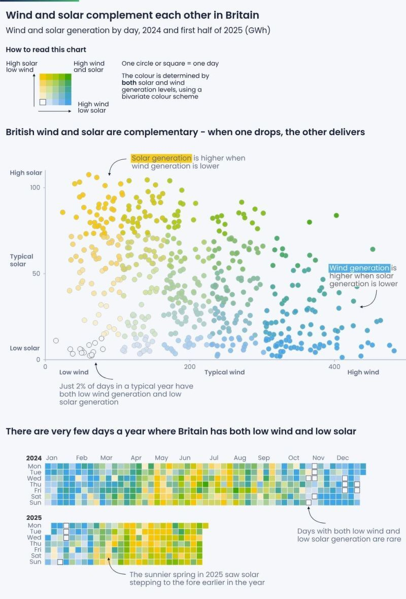
I discovered this particular one via LinkedIn, but the original creators of this infographic, Ember Energy, has loads of them on their website – mainly focused on the EU.
Source: LinkedIn