
An incomplete collection of charts
Some pretty stark charts showing the impact of the Covid-19 pandemic on the world, in this case using data about the USA. What I like about the way they’ve done this is that, for many of them, ‘trend lines’ are included which allow you to see whether things have gone back to ‘normal’ or stayed… weird.
Over here, unlike other developed nations, the UK has experienced a sharp rise in the post-pandemic number of health-related benefit claims. The number of 16 to 64 year-olds on disability benefits in England and Wales now stands at 2.9m, an increase of almost a million. Around half of those are mental-health related claims. It is ridiculous, therefore that the Labour government is planning to cut disability benefits while “help[ing] those who can work into work.” Forcing, more like.
My wife and I “celebrated” our 40th birthdays during lockdown, so the pandemic has pretty much cleaved our lives into two: there was what came before and now what has come after. At the moment, I massively preferred what came before. How about you?
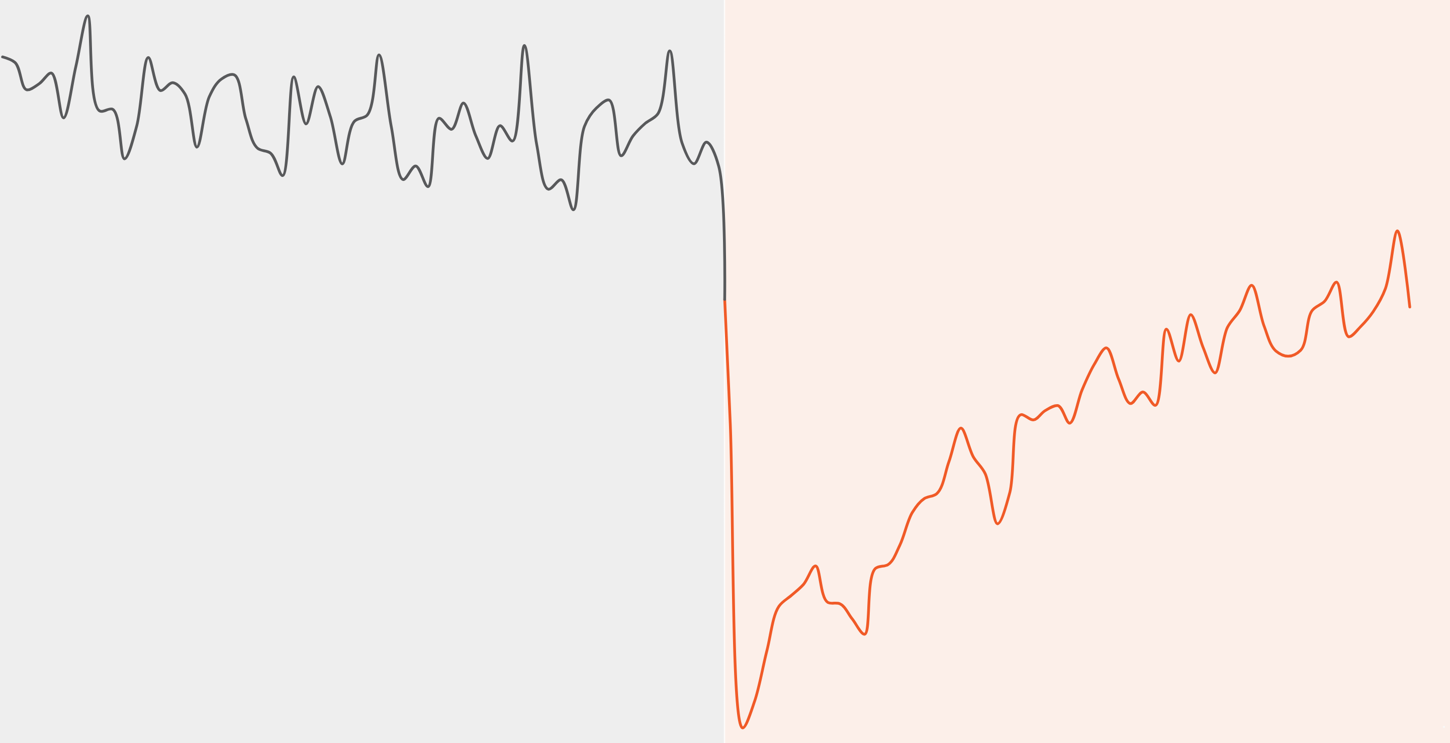
Decades from now, the pandemic will be visible in the historical data of nearly anything measurable today: an unmistakable spike, dip or jolt that officially began for Americans five years ago this week.
Here’s an incomplete collection of charts that capture that break — across the economy, health care, education, work, family life and more.
Source & image: The New York Times