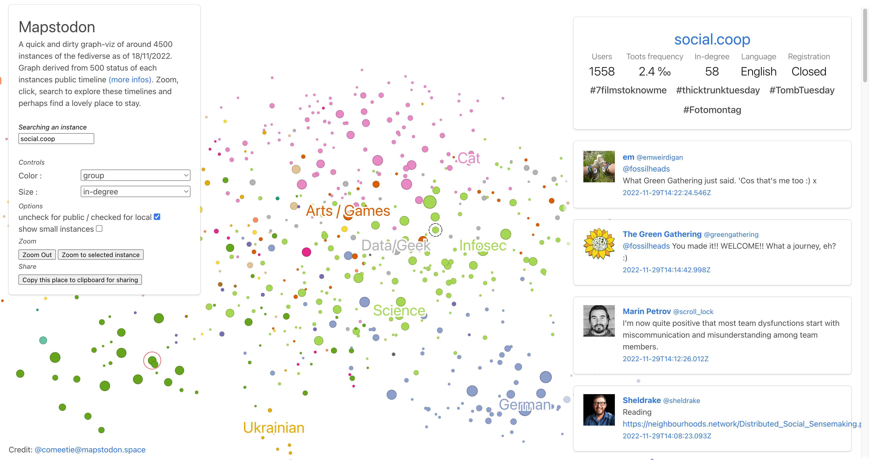
(Partially) visualising the Fediverse
About a decade ago, it was possible to visualise your LinkedIn network. I really liked it, especially as I had three distinct groups of connections (EdTech, schools, and Higher Ed).
This website allows you to visualise around 4.5k Fediverse instances, as of last week. You can change the colour and size of the dots depending on number of users, posts, theme, etc.
Exercise.cafe isn’t on there, nor is wao.wtf. But it’s still a useful tool.
Source: Mapstodon
