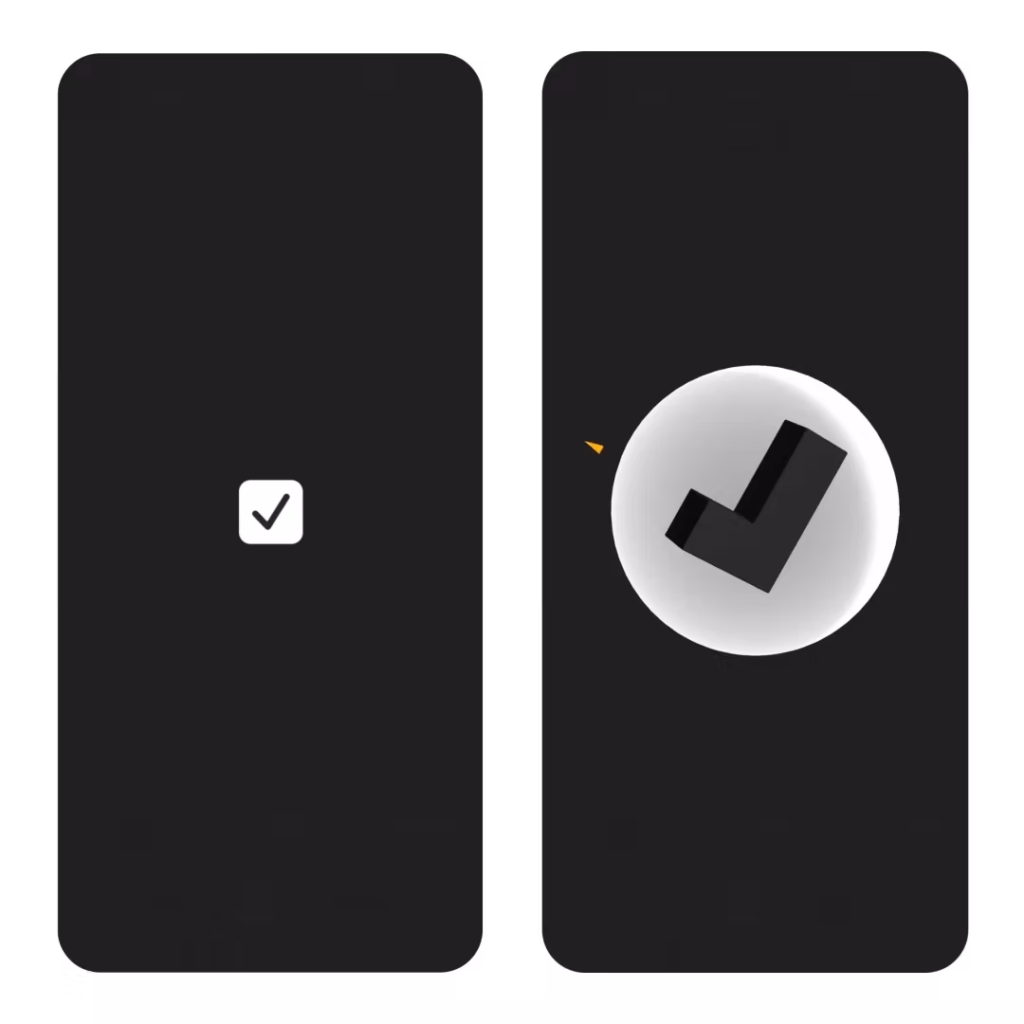
Who knew tapping a checkbox could be so satisfying?
I love it when people who are great at what they do, and who sweat the details, share their processes. It’s well worth looking at the lengths this designer has gone to in order to make tapping a simple checkbox feel like an achievement. Visuals, sound, haptics, the lot!
These things matter. One of the reasons I like Trello so much, for example, is the confetti that emanates from the card when you drag it to ‘done’.
If we can add Feel to the humble checkbox, imagine what it could do for apps that aid in personal connections or creativity. Many of us make the mistake in thinking of the apps we design as public spaces—drawing inspiration from the rationality of airport signage or the deference of an art gallery. We completely forget that these experiences are also incredibly personal. And while a clean, white gallery space may be beautiful in its minimalism, it’s not the comforting place most would want to live.Source: The World’s Most Satisfying Checkbox | (Not Boring) SoftwareDesign can be reductive and rational. But it can also add richness to our lives.
Maximize that.
And use every tool you can get your hands on.
