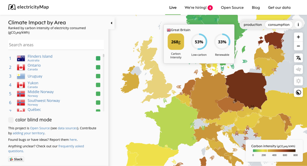
Live map of electricity production highlights carbon criminals
This live map of electricity production and consumption is really interesting, on a number of levels. First, it’s great that it exists! It really helps show, for example, that Poland needs to get its act together.
But also, design decisions matter. For example, the focus on carbon, while important, obscures the fact that nuclear might help get us out of the current mess but is really storing up problems for future generations.
electricityMap is a live visualization of where your electricity comes from and how much CO2 was emitted to produce it.Source: electricityMap | Live CO₂ emissions of electricity consumption
